Nutrien's Mining Operational Experience Enhancement

The problem
The project centered on two interconnected applications - a tablet-based logbook and a desktop management and operations app, used daily by nearly 15,000 mining personnel worldwide. Despite their intention to digitize and streamline complex processes such as inspections, maintenance, and hoisting operations across multiple sites and logbook types, the products struggled to meet their goals.
Low adoption rates revealed that users still preferred pen-and-paper workflows. The existing design suffered from inconsistent structures, cluttered interfaces, confusing navigation, and unclear component behavior. Critical data also failed to translate smoothly from the logbook to the operations app, interrupting end-to-end workflows. In addition, the system lacked a structured way to manage users, roles, and permissions.
Together, these issues created friction, reduced trust in the tools, and prevented the digital solution from supporting the operational efficiency it was designed to achieve.
My contribution
When I joined the project, my first priority was to understand the product and the ecosystem around it. I reviewed the existing design artifacts, spoke with the product owner, business analyst, and broader team, and collaborated closely with engineering to walk through the UAT and staging environments. This gave me a grounded understanding of what existed, what was missing, and where the product needed to go.
I quickly realized that the project had never incorporated personas, even though the user landscape was complex and diverse. After gathering initial insights, it became clear how essential personas would be for aligning the team and grounding decisions. I scheduled multiple sessions with end users and business stakeholders, facilitated proto-persona workshops, and developed the project’s first set of personas. These became a shared reference point that helped the team prioritize decisions with real-world context rather than assumptions.
To deepen this understanding, I created journey maps and user flows informed by our discussions and research. These artifacts gave the team a clear visual narrative of user motivations, pain points, and opportunities for improvement. In parallel, I conducted a UX assessment of the existing designs, identifying key friction points and offering actionable recommendations for enhancing the overall experience.

Persona creation in progress

The userflows to map the user journey

Roles and permission mapping for user management

UX assessment and recommendations
The scopes were prioritized, and I worked with the business analyst for the creation of the UX stories in the design kanban board. I maintained and groomed the stories. During the redesigning of the platforms, I had collaborative sessions with the product and engineering leads to validate the processes and the data structure and assess the reusability of the component library assets to reduce the development effort. As a part of the design process, I flagged accessibility issues existing in the platform. Some of them were approved for the current roadmap, whereas others were parked for future consideration.

Accessibility work
I also conducted the project’s first usability tests on the redesigned flows and shared the findings with the team. This became an important milestone, as it demonstrated how usability testing reduces risk, minimizes rework, and validates that the solution is moving in the right direction. In addition, I played an active role in design QA reviewing visual execution, micro-interactions, functionality, and content to ensure the final product aligned with the design intent.

Setting up usability test


Analyzing test results and heat map
Hi-fidelity design


The impact
The final designs led to meaningful improvements across the product, the workflow, and the team:
-
The interfaces became significantly cleaner, more focused, and easier to navigate.
-
Component usage was standardized, creating consistency across both platforms.
-
The component library was expanded and updated with accessible, WCAG-aligned assets.
-
By designing reusable components, we reduced engineering effort by roughly 30%.
-
Users gained clear visibility into inspection statuses, categories, and progress.
-
Navigation across multiple logbooks and inspection types was simplified and more intuitive.
-
The responsive experience improved, ensuring better usability across devices.
-
Component behaviors and functionalities were clearly defined, reducing ambiguity in both design and development.
-
Digital adoption increased, with more users choosing to complete workflows within the app rather than reverting to pen and paper.
-
Notably, operators who were older and less comfortable with technology expressed appreciation for the improved clarity and ease of use.
-
The process also strengthened collaboration between design and engineering, breaking silos and building a more cohesive working relationship.
Impacts and Learnings
-
Personas created a shared understanding of the users, helping cross-functional teams stay aligned with real needs and make more informed product decisions.
-
Ongoing collaboration with product and engineering strengthened alignment, ensuring that decisions were validated early and contributed to building a more cohesive, successful product.
-
Usability testing became a catalyst for informed decision-making, revealing hidden problems, uncovering new opportunities, and clarifying user expectations before development.
-
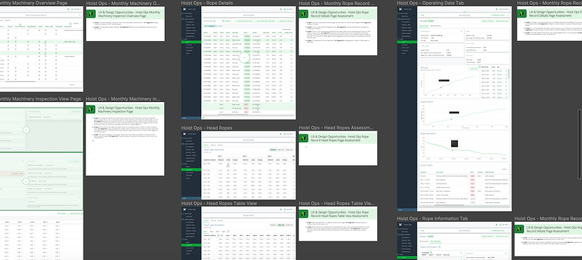
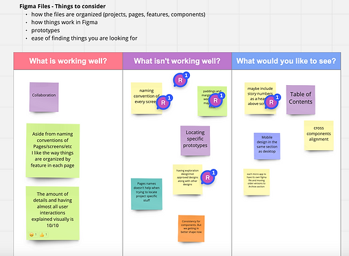
A structured Figma organization system improved efficiency, making files easier to navigate and saving time across design and engineering teams.
-
Introducing a visual scope–effort–timeline reference gave the team clarity and visibility, helping everyone stay aware of progress and make smarter decisions when working within tight timelines.

Scope - UX effort - UX value - time mapping