Mining Operational Experience Enhancement at Nutrien

The Overview
This project involved redesigning two interconnected applications used by nearly 15,000 mining personnel worldwide:
-
a tablet-based logbook used by operators for daily inspections, and
-
a desktop operations and management app used by supervisors and administrators.
Both were created to digitize a highly complex workflow consisting of multiple logbooks, inspections, categories, and hoisting operations across global sites. Despite the vision, adoption was low and users continued to rely on pen and paper.
My role as the Senior UX Designer was to unify these experiences, streamline workflows, re-establish design clarity, and bring the system back in alignment with real operational needs.
The Problem
Although the products aimed to simplify operations, several critical issues prevented successful adoption:
-
Interfaces were cluttered, inconsistent, and unintuitive.
-
Navigation patterns varied between logbooks and inspection types.
-
Component behaviors were unclear and difficult for users to predict.
-
Data didn’t translate smoothly between the logbook and the operations app.
-
There were no personas, no shared understanding of the users, and no clear mental model guiding design decisions.
-
User and role management was nonexistent.
-
Most importantly, users, especially older operators with low tech familiarity found the tools difficult and unreliable, reverting to manual processes.
These gaps undermined trust, slowed the workflow, increased operational risk, and blocked the product from achieving its intended value.
My Approach
Deep Immersion in the Product Ecosystem
To understand the existing complexities, I:
-
Reviewed all available design artifacts.
-
Met with the product owner, business analyst, and other stakeholders.
-
Worked closely with engineering to walk through the UAT and staging environments.
This helped me map what had been built, what was missing, and where the product needed to evolve.
Introducing Human-Centered Foundations: Personas & Research
I quickly realized the project had never included persona work despite the complexity of its user base. To address this:
-
I conducted live sessions with operators, supervisors, and business stakeholders.
-
Facilitated proto-persona workshops to align assumptions.
-
Developed the first set of personas, which became a shared reference to guide decisions.
-
Built journey maps and user flows to uncover motivations, pain points, and opportunities.
These artifacts grounded the team in real-world needs and transformed how decisions were made.

Persona creation in progress

The userflows to map the user journey

Roles and permission mapping for user management
UX Assessment & Redesign Strategy
I performed a detailed UX audit to identify pain points across the existing designs, including:
-
confusing navigation patterns
-
inconsistent component structure
-
accessibility violations
-
missing validation states
-
unclear data hierarchy
I then translated findings into actionable recommendations and a redesign strategy that the entire team could rally behind.


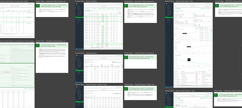
UX assessment and recommendations
Process Alignment through Collaboration
To ensure alignment throughout the redesign:
-
I collaborated closely with product and engineering leads to validate workflows and data structures.
-
Assessed and improved the reusability of component library assets to reduce engineering effort.
-
Flagged accessibility issues and worked to incorporate as many as possible into the immediate roadmap.
This tight collaboration became essential for predictable, risk-managed delivery.

Accessibility work

Scope - UX effort - UX value - time mapping
Introducing Usability Testing to the Project
I conducted the project’s first round of usability testing on new design flows.
The findings:
-
revealed hidden usability issues early
-
reduced future rework
-
validated the design direction
-
helped the team recognize the importance of continuous testing
This established usability testing as a standard practice moving forward.

Setting up usability test


Analyzing test results and heat map
Hi-fidelity Design


Strengthening Design-Engineering Collaboration through Figma Governence
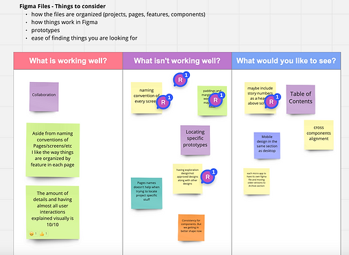
One unique initiative I introduced was a workshop dedicated to improving Figma file organization and naming conventions.
I discovered developers often couldn’t locate the correct pages or mockups. To fix this, I:
-
led a session evaluating the existing file structure
-
created shared standards for naming, organization, and work phases
-
reorganized the files to increase discoverability
This significantly reduced friction during handoff and built trust between the teams.

Outcomes & Impact
Product Impact
-
Interfaces became significantly cleaner, crisper, and easier to navigate.
-
Components were standardized across platforms, improving predictability.
-
The component library was updated with accessible, WCAG-aligned assets.
-
Reusable components reduced engineering effort by approximately 30%.
-
Users gained clear visibility into inspection statuses, categories, and progress.
-
Navigation across logbooks and inspection types was simplified.
-
The responsive experience was strengthened across devices.
-
Functionalities were clearly defined, eliminating ambiguity for both users and developers.
User Impact
-
Digital adoption increased as more users shifted away from paper-based processes.
-
Older operators—who were initially resistant to technology—expressed appreciation for the clarity, simplicity, and improvements made.
-
Confidence in the digital workflow increased across roles and locations.
Team & Organizational Impact
-
Personas helped cross-functional partners make informed, user-centric decisions.
-
Continuous collaboration improved alignment and reduced back-and-forth cycles.
-
Usability testing became a key validation tool for the team, uncovering problems early.
-
Figma reorganization saved time, increased file discoverability, and reduced handoff friction.
-
A visual scope–effort–timeline reference clarified priorities and ensured the team stayed aligned under tight deadlines.
-
Silos between design and engineering were broken down, strengthening relationships and establishing a healthier workflow.
Conclusion
This project was more than a redesign. It rebuilt clarity, trust, and collaboration around a mission-critical operational tool. By grounding decisions in user understanding, aligning cross-functional teams, and introducing new processes, we delivered a system that not only improved the product but transformed the way the team works together.flow.