CASE STUDY 02
Mining
operational
Experience
A performance dashboard that stopped showing data - and started telling the truth behind it.
PERSONAS . UX AUDIT . USABILITY TEST . DESIGN
CLIENT
Nutrien
DOMAIN
Operations UX . Mining
MY ROLE
PLATFORMS
Senior UX Designer
Tablet (Logbook) . Desktop (Ops App)
IMPACT
ADOPTION
-30% ENGG EFFORT
TEAM TRUST
OVERVIEW
Two apps
one broken experience.
This project involved redesigning two interconnected applications used daily across Nutrien's global mining operations: a tablet-based logbook for operators running daily inspections, and a desktop ops and management app used by supervisors and administrators.
Both were built to digitize a highly complex workflow - multiple logbooks, inspection categories, and hoisting operations across global sites. Despite the ambition, adoption was critically low. Users continued to rely on pen and paper.
My role: unify these experiences, streamline the workflows, re-establish design clarity, and realign the product with how people actually work.
15K
MINING PERSONNEL
AFFECTED
2
INTERCONNECTED
PLATFORMS
-30%
REDUCTION IN ENGINEERING EFFORT
A mission-critical operational tool - used in environments where clarity isn't just a UX goal, it's a safety consideration.

THE PROBLEM
Built to simplify
doing the opposite.
Although both products aimed to reduce operational complexity, several critical issues prevented successful adoption - and in a mining context, adoption isn't just a product metric. It's a safety variable.
" Users, especially older operators with low tech familiarity, found the tools difficult and unreliable - and reverted to manual processes."
Cluttered, inconsistent interfaces
with no clear visual hierarchy or interaction logic across screens.
Unpredictable navigation
that varied between logbooks and inspection types - building user anxiety rather than confidence.
No personas, no shared user understanding
the product had been built without a clear mental model of who was using it or how.
Data gaps between platforms
information didn't translate smoothly between the logbook and the operations app, creating trust issues on both sides.
No user or role management
a fundamental capability missing entirely from the system.
Accessibility issues
that compounded difficulty for users with low digital literacy, especially older operators.
MY APPROACH
Understand the system
before redesigning it.
Before any sketching or wireframing, I needed to map the full ecosystem - what had been built, what was missing, and where the product needed to evolve. I started with deep immersion: reviewing all available artifacts, meeting with the product owner and BA, and walking through UAT and staging environments with engineering.
PHASE 01
Product Ecosystem Audit
Reviewed all design artifacts and walked through live UAT environments with engineering to map what was built vs. what was intended.
PHASE 02
Human-Centered Foundations
Conducted live sessions with operators, supervisors, and stakeholders. Facilitated proto-persona workshops to create the product's first shared user reference.
PHASE 03
UX Audit & Strategy
Performed a detailed UX assessment covering navigation, component consistency, accessibility, validation states, and data hierarchy.
PHASE 04
Collaborative Redesign
Worked closely with product and engineering leads to validate workflows, improve component reusability, and manage accessibility improvements in the roadmap.
PHASE 05
Usability Testing
Introduced the project's first round of usability testing on new design flows - establishing it as a permanent validation practice going forward.
PHASE 06
Figma Governance
Led a workshop to establish shared naming conventions and file structure standards - directly reducing handoff friction with developers.
RESEARCH & FOUNDATIONS
First personas
this product ever had.
The project had never included persona work despite the complexity of its user base - operators, supervisors, and administrators all with very different needs, contexts, and levels of tech familiarity. I facilitated proto-persona workshops and built the first set of shared user personas, which became a living reference for every design decision that followed.

PERSONA CREATION - MIRO WORKSHOP

USER FLOWS MAPPING END TO END JOURNEY

ROLE AND PERMISSIONS MAPPING FOR USER MANAGEMENT
UX ASSESSMENT
Naming what
wasn't working.
I performed a detailed UX audit across the existing designs - not to critique, but to create a shared, evidence-based foundation for the redesign. Issues were documented, categorized by severity, and translated into actionable recommendations that the full team could align behind.

UX ASSESSMENT AND RECOMMENDATIONS

ACCESSIBILITY WORK WCAG ALIGNED

SCOPE-EFFORT - TIMELINE PLANNING
USABILTY TESTING
The project's
first test.
I introduced usability testing to a project that had never run a formal test. The first round validated new design flows, revealed hidden usability issues before they reached production, and crucially helped the team understand the value of continuous testing as a practice, not a one-off event.

TEST SETUP


TEST ANALYSIS

HEATMAP REVIEW
HI-FIDELITY DESIGN
Screens that
earn trust.
Clean, consistent, and predictable - every design decision was grounded in the persona and workflow work done earlier. Components were standardised, WCAG-aligned, and built for reuse across both platforms.


DESIGN - ENGINEERING COLLABORATION
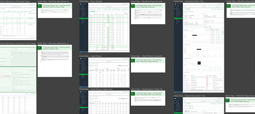
When developers
can find the file.
One initiative that had outsized impact relative to its effort: a workshop dedicated to Figma file organisation and naming conventions. Developers couldn't find the right pages. Mockups were buried. Handoffs were slow and frustrating on both sides.
Figma Governance Workshop
A collaborative session that turned a persistent friction point into a shared standard - and built trust between design and engineering in the process.
01
Evaluated the existing file structure with developers to understand where confusion was happening
02
Created shared standards for naming conventions, page organisation, and work phase labelling
03
Reorganized existing files to match the new standards immediately - not deferred to "next sprint"
04
Established the standards as ongoing practice - not a one-time fix
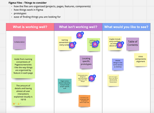
FIGMA GOVERNANCE WORKSHOP WITH TEAM
OUTCOMES & IMPACT
What actually
shifted.
PRODUCT IMPACT
Interfaces became significantly cleaner and easier to navigate - predictable by design.
USER IMPACT
Digital adoption increased as users moved away from paper-based fallback processes.
TEAM & ORG IMPACT
Personas gave cross-functional partners a shared reference for decisions - reducing opinion-based debates.
Components standardised across both platforms, eliminating the inconsistency that had driven user confusion.
Older operators - initially most resistant, expressed appreciation for the clarity and simplicity of the redesigned flows.
Usability testing became a standard validation practice, not a one-off.
Figma governance saved time, increased discoverability, and reduced handoff friction significantly.
Component library updated with WCAG-aligned, accessible assets.
Reusable components reduced engineering effort by approximately 30%.
Confidence in the digital workflow increased across roles and global locations.
Silos between design and engineering were broken down, establishing a healthier, more collaborative workflow.
Navigation across logbooks and inspection types simplified into coherent patterns.
This project was more than a redesign. It rebuilt clarity, trust, and collaboration around a mission-critical operational tool - and transformed the way the team works together long after the screens shipped.